The retail store layout, also called store design or layout design, is the way retailers set up their product displays, merchandise, and fixtures in-store. For furniture stores, well-designed store layouts will attract customers in, circulate them around the space, and interestingly show merchandise. The main goal of retail layout is to guide customers to find what they want easily, encourage them to buy, and give them a memorable shopping experience. In this article, we’ll walk you through different types of store layouts and share the best practice tips to design an innovative and inviting furniture store layout.
Store layout types
Depending on your industry, space, and brand identity, there are many store layout types to consider. Here are the most popular options:
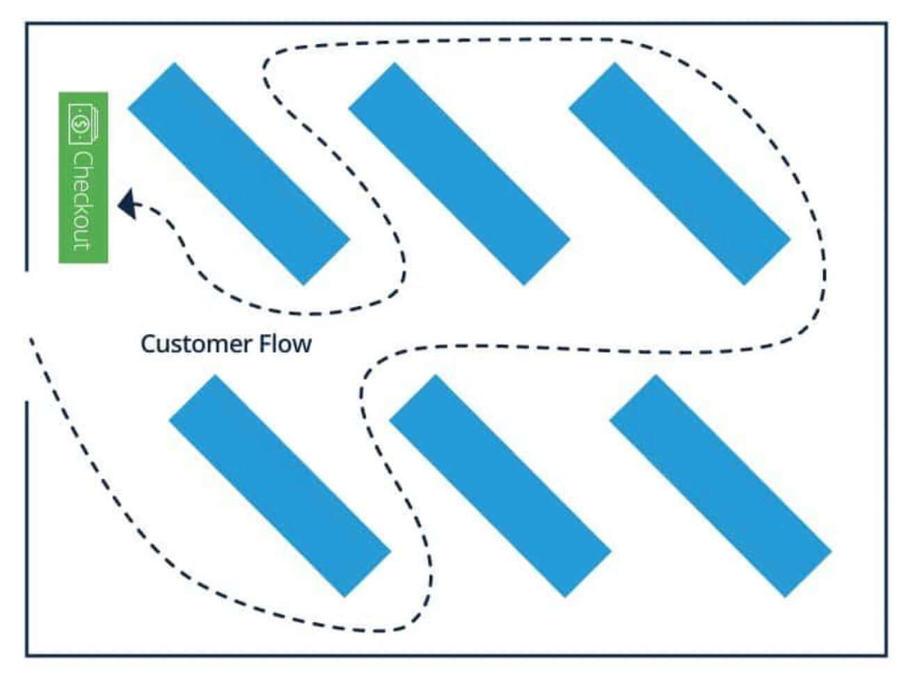
1. Force-path layout
Force-path layout
Force-path layout leads customers on a defined route through the store. With this design, you can plan where to put suitable products, knowing that customers will pass the section and see your items. IKEA is an example of using the forced-path store design and achieves a uniform and efficient customer flow that boosts their sales.
Pros
- Maximize every aisle in the store;
- Expose all merchandise you have to customers, therefore enticing them to make an unplanned purchase.
Cons
- Risk irritating shoppers who have a specific task and desired location;
- It may be overwhelming for customers to move through the aisles in one direction together and quickly.
2. Grid layout

Grid layout
A grid layout displays merchandise in long aisles where customers browse for items as they go, weaving up and down. This layout maximizes product display and minimizes white space, which is best utilized by convenience stores, pharmacies, and grocery stores.
Pros
- Best for retail stores with various merchandise types;
- Familiar with shoppers;
- Predictable traffic flow so that you can place promotions where customers are most likely to see them.
Cons
- Few visual breaks and tons of merchandise can be overwhelming for customers;
- Customers may find it hard to understand your product groupings;
- Cramped aisles may cause customers to bump into one another.
3. Racetrack layout (loop layout)

Racetrack layout (loop layout)
The racetrack, or loop store layout, evolves the traffic flows and creates a deliberately closed loop. It directs customers from the store’s front, to pass every corner of products, and to the checkout. This is an effective design for stores that want to show customers their entire inventory.
Pros
- Maximum floor space and product exposure;
- Predictable traffic flow pattern to place promotions where they’ll be seen;
- Easy to organize and display products.
Cons
- Speed up traffic, causing customers to spend a short time in-store considering products;
- Little exciting elements in the customer journey;
- Discourage shoppers from getting off the aisle.
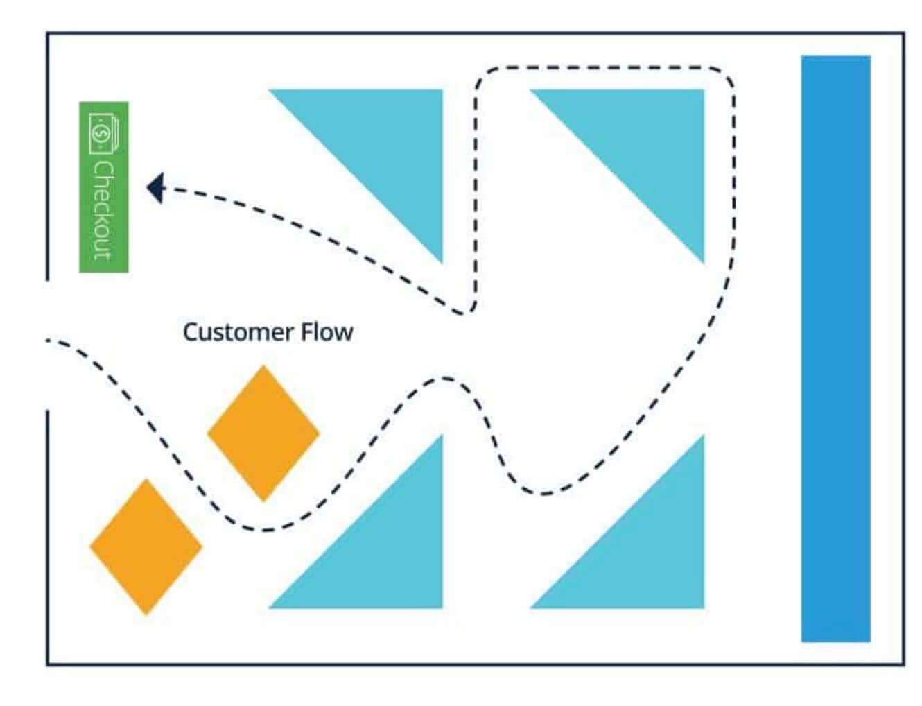
4. Diagonal layout
Diagonal layout
The diagonal layout has a similar arrangement to the grid layout, but all the shelves are placed diagonally. The diagonal store layout offers better visibility for the items on each shelf and creates a more open feel to the store. This type of layout is space-efficient and works best for stores that have a large foot traffic amount.
Pros
- Good customer circulation;
- If you put the checkout counter in the center of the store, the diagonal layout gives better surveillance to see throughout the store.
Cons
- Shoppers cannot take a shortcut to specific products they plan to buy;
- Aisles are narrower in the diagonal store layout.
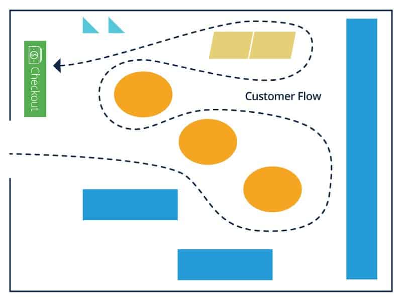
5. Angular layout

Angular layout
The angular layout uses rounded product displays such as curved walls, corners, and other curved fixtures to drive the customer flow. By using free-standing product displays, this layout can generate a high-quality perception of merchandise, therefore mainly chosen by luxury retailers and boutiques.
Pros
- Create a unique and exciting retail store design;
- Elevate the in-store shopping experience.
Cons
- Rounded displays remove wall-shelf space;
- Fewer items can be displayed.
6. Geometric layout
Geometric layout
The geometric store layout combines creativity and functionality. It creates a modern look by using sharp lines with different display sizes to highlight specific products and build your brand identity. The geometric layout is common for apparel shops, as it displays clothing in a fun and interactive way.
Pros
- Create a unique store layout design without a high expense;
- Strengthen the product statement.
Cons
- Not suitable for older audiences;
- Not maximizing space to display merchandise.
7. Free-flow store layout
Free-flow store layout
A free-flow layout doesn’t intend to lead customers with predictable displays, design patterns, or signage. Since there are no design rules for this type of layout, customers have more freedom to navigate and interact with merchandise as they want.
Pros
- Flexible layout and easy to change;
- Slow down traffic and encourage exploration;
- Create open sightlines;
- Create more space between products;
- Good choice for high-end shops with fewer products;
- Create an experiential retail environment.
Cons
- Lack of good organization will lead to more crowded and over-merchandised space;
- Customers may be overwhelmed and confused;
8. Boutique store layout
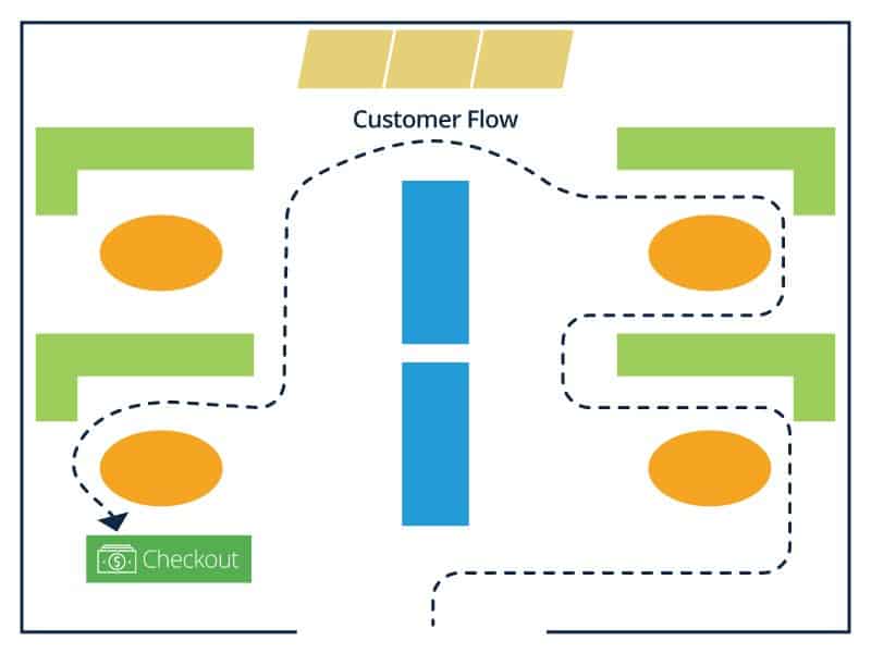
Boutique store layout
The boutique layout is the most commonly used type of free-flow layout. It separates merchandise by category and encourages customers to interact more closely with items in semi-separate areas created by walls, fixtures, and merchandise displays. This layout stimulates customer curiosity to explore different merchandise brands or themes inside a category and is favored by boutique clothing retailers, wine merchants, and gourmet markets.
Pros
- Trigger shopper curiosity;
- Feature different brands and product categories;
- Support cross-merchandising and cross-selling.
Cons
- Limit the total space for merchandise display;
- Customers may not explore the entire store;
- May confuse customers.
How to plan store layouts to maximize space

To plan a strategic floor plan furniture store layout and maximize space for your furniture showroom design, you must understand your customer flow and the general navigation patterns for your retail environment. Here are the steps to follow:
Step 1: Aim for the first floor
Most customers prefer single-level stores. According to Claus Ebster, a famous consumer behavior expert, they are most comfortable shopping on the first floor they enter. Staircases, elevators, and escalators can disrupt customer flow and create a daunting and off-putting experience.
If you run a two-story space, use an escalator and put your high-margin products downstairs to have the best chance of selling. Other low-margin and discount items can be kept upstairs. Still, if possible, you should avoid anything like a mezzanine or second floor.
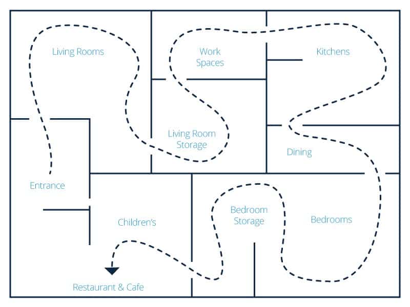
Step 2: Identify customer flow
Retail furniture store layout affects how customers navigate through your store. You should choose the floor plan furniture store layout that works with common shopping behaviors and create a smooth flow.
To plan properly, you should observe how shoppers interact with your store. Watch the way they go, where they pause, and what interests them. There are some tools to measure traffic patterns such as people counters, video cameras, beacons, heat tracking software, and more.
Step 3: Avoid the transition zone
The transition zone area, or the “decompression zone”, which is discovered by Underhill, is the space right beyond the entrance of a store. Customers need this space for a transition from the outside world to the new retail environment.
Underhill insists that you shouldn’t place anything here, not even brand information, high-margin merchandise, or prominent signage. Customers need a brief time and space to adjust to new visual stimulations, lighting, music and smell in the store.
Step 4: Design for clockwork navigation
Once shoppers get past the transition zone, 90% of the time they tend to turn right and walk counterclockwise through the space. This is called the “invariant right” turn.
With this behavior, the right side of a store is the ideal space to display promotional and highlight best-selling or high-margin furniture. It is also the starting point of the customer walkway around your store. Don’t place checkouts, customer service, or restrooms in this area.
Step 5: Avoid the butt-brush effect
Customers love wide and spacious walkways. According to Paco Underhill, the “butt-brush effect” is the inadvertent brushing of one shopper to another because of limited space. If a customer is bumped, touched, or interrupted during their shopping, they are likely to pass the items or exit the store.
When designing your furniture store floor plan, the main aisles should be wide enough for customers to browse products comfortably without worrying about bumping into others. Women especially need their personal space, so wider aisles make up a more positive overall experience. Thus, review your store layout and check for tight spaces or bottlenecks that may be hard for customers to browse the merchandise.
Furniture store layout best practices to increase customer experience

Let’s explore the top 7 furniture store layout ideas.
1. Use the right store layout
There are 2 ideal types of store layouts for furniture retailers: the racetrack and the free flow plan.
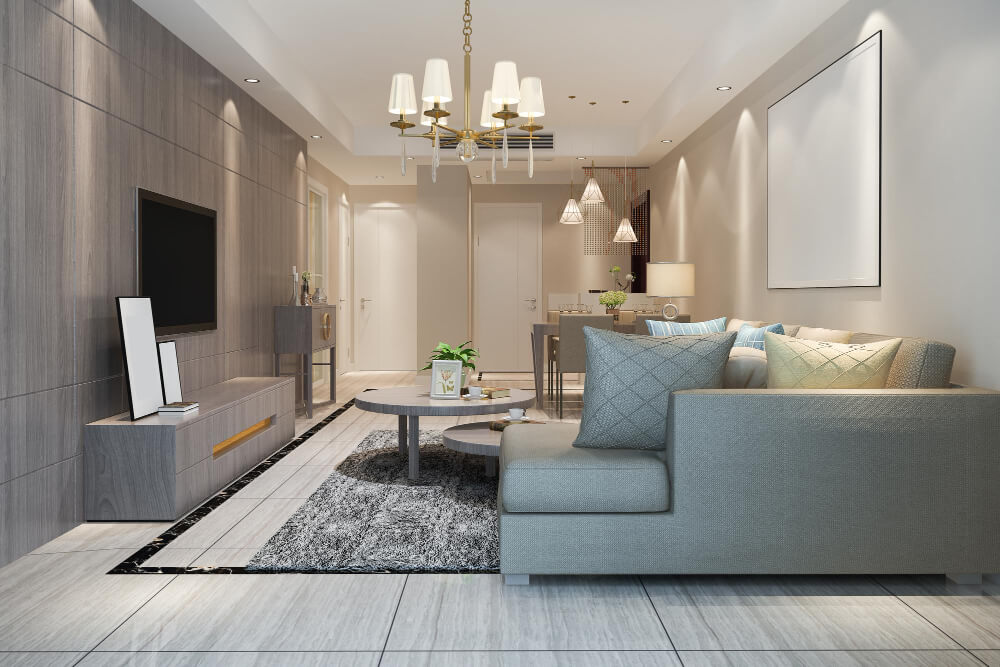
The racetrack store layout loops shoppers on a predetermined pathway around the store and back. You can use a visible and easy-to-understand loop to tell the brand story as customers circulate your store. In addition, adding focal points and visual displays can help make the blank walkway more interesting. Among many sub-layouts of a racetrack plan, a loop with straight aisles is the best furniture store layout design. This layout type allows retailers to divide room sets into each available square footage, keeping the merchandise neat and easy to configure.
A free flow plan, removing defined aisles, encourages customers to shop at their own pace. By arranging your furniture products, you can define the walkways. This layout gives you more flexibility to move departments and merchandise around to figure out where they perform the best. Although the free-flow plan is a more modern and sophisticated approach to furniture store layout, it requires an organized approach to plan spaces and prevents the furniture from blocking the flow. Retailers must manage how to layout a furniture store and present the merchandise in a disciplined way.
You can use a furniture store floor plan layout software to help you design the right layout for you.
2. Product displays
Every furniture store owner wants shoppers to see the best and most appealing merchandise when they enter the store. Here are the best furniture showroom display ideas:
- Classify items by room sets for easy browsing. In a store layout example for a bedroom, you can put mattresses, nightstands, dressers, bedroom benches, vanities, etc.
- Don’t place your products too deep inside because it discourages customers from exploring the merchandise. Customers prefer to shop for item sets close to the aisle, hence, more aisles will lead them to see all your products.
- For small items like lamps and ornaments, you should keep your products at eye level and within reach.
- Make use of the walls to display immersive graphics that show how the furniture will look in a real home.
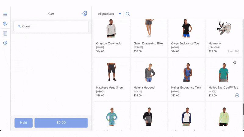
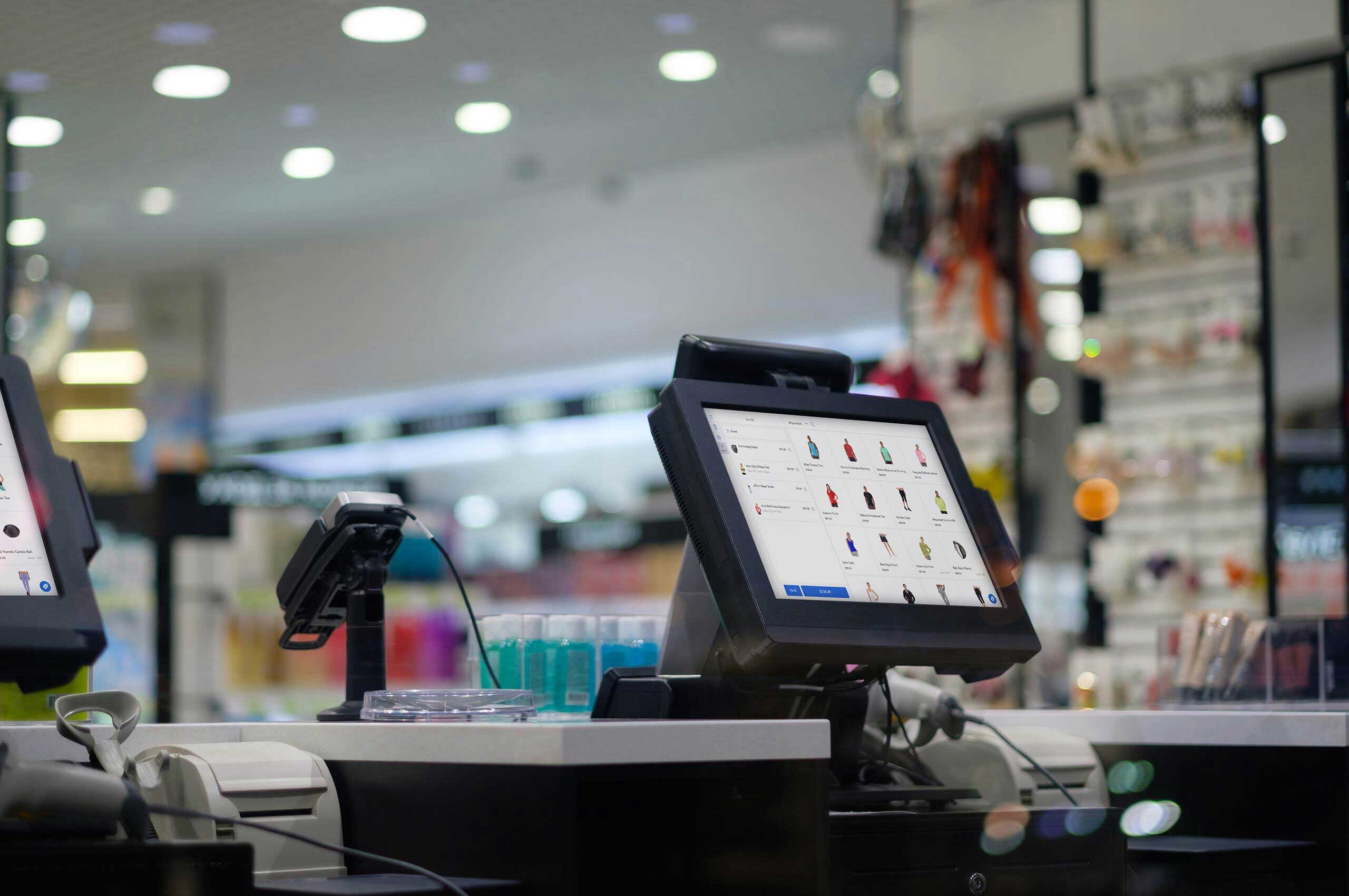
- Use a furniture POS to control your products and manage warehouses, so that you can easily locate and track items.
3. Consider the location of each section
Your store consists of multiple areas that need proper location planning to create a smooth and natural customer flow. Here are some ideas for an organized floor plan furniture store layout:
- Place your checkout counter and customer service at the store’s central location, so that it can be seen from multiple points to help customers orient themselves and easily find their way around.
- Arrange a focal point at the end of each aisle where customers walk towards. Never put warehouse doors, for instance, to be the focal point.
- If you have a design center, you should place it in the center of your upholstery and motion departments. This is an eye-catching area that can be a focal point to slow customers down or re-route them.
4. Think about aisles and floor space
Designing a furniture store floor layout needs careful consideration for aisles and space to provide a pleasant and leisurely shopping experience. Here are what you should apply:
- Make sure the aisles are open and uncluttered and set up wayfinding signage that shows visitors to explore different sections.
- Avoid dead-end walkways. You should define walkways to loop around in some way instead.
- Consider discarding the 90-degree corners on the aisles. You can use a roundabout circle with a focal point in the center to draw customers.
- Leave your customers with enough personal space to freely move around and not brush up against fixtures or other customers.
5. Window display
Your retail window display is the first impression to a potential customer. A well-designed window display can help your business stand out from competitors, capture the attention of bypassers, and increase in-store foot traffic. It also shows your brand personality and gets people to stop, look, and then go into your shop, creating an opportunity to engage and make a sale.
To do that, you can display inviting banners, entrance signages, and featured products (such as a room set) that show tempting offers, letting visitors know what they can expect inside the store. It is part of the furniture marketing strategy.
6. Incorporate cross-merchandising
Cross merchandising, or secondary product placement is a great method to organize complementary products next to each other to boost sales. For example, if you sell a dining set, dining lights and utensils can be some options to cross-sell.
Cross-merchandising creates a convenient shopping experience, where customers can spark ideas or get reminded of additional products they need. If you arrange things right for this furniture store design technique, you’ll see a rise in revenue and your average order value.
7. Spruce up your displays regularly
Updating your product displays and merchandise assortment can attract customers to come back more often to check out new products. Test different looks for your store by moving merchandise from the front to the back and from the middle to the front, while still keeping the logic of categories. Besides, whenever you receive a new product shipment, display them right away in the store area that has high foot traffic.
How often you refresh your store can depend on many factors, such as how regularly you receive new merchandise shipments, and how frequently shoppers return. Still, the main idea is to ensure customers don’t get too familiar with your furniture displays to the point that they don’t want to come back anymore. Frequent changes will attract them to explore your store.
In conclusion
Above are the top 7 furniture store layout best practices that can help you bring your in-store experience to the next level. Analyze your customers’ behaviors and think creatively about how to design a layout that leads shoppers around your store pleasantly and interestingly. If well-executed, you will have more flexibility to display product sets, while your customers can enjoy their shopping experience, and spend more time and money with your store.


How often you refresh your store can depend on many factors, such as how regularly you receive new merchandise shipments, and how frequently shoppers return. Still, the main idea is to ensure customers don’t get too familiar with your furniture displays to the point that they don’t want to come back anymore. Frequent changes will attract them to explore your store.
Nice blog, Loved the Diagonal layout.
I hate diagonal layouts with a burning passion. That’s how every shoe store looks and I always swore I’d never use it for the reason that you included: shortcuts are impossible.