
Mobile purchase is on the rise and everybody’s talking about m-Commerce. However, as a store owner, you may feel overwhelmed with so much technical information on how to improve your online retail with mobile. If you’re thinking about building a mobile app for your online store or adapting your website to the mobile platform, we can say that you’re on the right track. It’s time to find out how to turn this idea into dollars. This article will provide you with the 4 best practices to optimize your website on mobile to increase mobile conversion rate and revenue.
What is a good mobile conversion rate?
According to Monetate eCommerce’s 2020 Report, the average eCommerce conversion rate is 1–3%. Here is a smaller breakdown conversion rate by device:
- Desktop: 1.98%
- Mobile phone: 1.81%
- Tablet: 2.92%
That means most of your website visitors won’t make a purchase. However, this is absolutely normal because not all of the people visiting your website have a clear intention to make a purchase. 1–3% sounds so tiny but it’s actually pretty great. If your mobile conversion rate is 3% and your website has 100,000 visits per month, you’ll have 3,000 purchase orders.

It’s also important to know that it’s a big deal to have a 0.5% jump in mobile conversion rate. From the above data, although mobile conversion rate is a little smaller than desktop. GlobalStats’ Statcounter indicates that on a global scale, 54.6% of website visits come from mobile and only 42.63% come from desktop by 2021. So, optimizing mobile conversion rate can have a double effect on your revenue and you should focus on taking needed actions for mobile conversion optimization.
What metrics determine the mobile conversion rate?
Conversion rate is the final metric and influenced by many aspects of the customer journey on your website. Each touchpoint is a customer’s decision to stay or go to the end of the road, so you shouldn’t draw conclusions from tracking a single metric. Multiple metrics are contributing to the mobile conversion rate that you can inspect and analyze together, including:
- User engagement metrics:
- Churn rate
- Retention rate
- Bounce rate
- Session length
- Daily and monthly active users
- Stickiness
- UX and performance metrics:
- Website loading speed
- Crash reports

Factors that contribute to mobile conversion optimization
Adobe’s latest webinar on how to capture more mobile revenue gives out some surprising and inspiring statistics for mobile conversion optimization:
- eCommerce mobile website design: mobile UX and design is a perfectly balanced construct. Each piece of space is extremely valuable, so it’s important to consider the appropriate placement and design in accordance with its value.
- Changing default credit card forms may increase revenues by 21.53%.
- Choosing suitable icons for mobile checkout can improve revenue by 17.37%.
- Page loading speed:
- Mobile pages that load 1 second faster can contribute to an increase of 27% in mobile conversion rate.
Mobile split testing (A/B testing) is often used to compare between options of changes. Then you can find out what is efficient and what isn’t. You can use this tool to determine the impact on your mobile conversion rate according to each change. But, what kind of changes can business owners apply to those factors to increase mobile conversion rate?
Best practices for mobile conversion optimization
1. Improve product browsing and exploration on mobile
As previously mentioned, most visitors that come to your website often have no idea of what to buy. They just had a common idea like “I needed to buy running shoes” or “a party dress”. The browsing and exploring area should help them narrow down their choices quickly and decide with as little effort as possible.

You can consider the following points for better mobile eCommerce design.
Menu and categories
For mobile conversion optimization, you should ensure that your visitors can use the navigation and category to browse options easily, but aren’t distracted or overwhelmed by too many options. Of course, the menu icon should be streamlined and simplified to save space, but they should never be hidden or excluded.
Our recommendations:
- Never hide the menu icon
- Don’t make the menu button blurry or hard to see. You can use a popular and familiar icon like the triple bar and put it near the top of the screen.
- Include the most popular subcategories in a drop-down menu, which can be scrolled alongside the menu from the top of the page
- Design for visitors to simply tap away when they want to exit the menu and return to the page they were viewing. A clear “X” button to exit or provide the ability to swipe to close the menu are good ideas.
Icons
Have you ever looked at an icon on your mobile phone but couldn’t interpret what it stands for? Then, did you click on that icon and try to see what it really is?
The answer is usually “No”. Visitors won’t click on an icon if they don’t know what it means. Not only the icon of the menu needs to be legible, but all icons and their meanings must be clearly presented to the customer for mobile conversion optimization. This applies to all icons on your pages and product details.
Our recommendations:
- Don’t leave an icon without a label. You should tell your visitors where the logo leads them to.
- Use a clear image to illustrate the icon as alternatives to labels
Categories
Some websites redirect their visitors to a new page that lists different subcategories right after visitors click the menu category. This is actually a mobile conversion optimization problem as it causes inconvenience to the browsing process. It prevents your visitors from going back and forth between categories easily and requires unnecessary loading time.
Our recommendations:
- When visitors click on the category tabs on your menu, make sure that the category tabs load immediately.
- Then, when they select a subcategory, it should take them to the appropriate page and your visitors can use filter options to narrow down their search.
Filters
The ideal mobile browsing experience starts with a full-page menu that visitors can use to select categories and subcategories easily for mobile conversion optimization.
Our recommendations:
- Once your visitors have landed on the category page, make sure they can refine the results further with options to view product categories, brands, and specific subcategories.
- Regarding filter options like price, size, and color, you can show a full page overlay for them to set these filter options. Visitors can view and tap options more easily and smoothly.
Call to action (CTA) buttons
These buttons need to be large for mobile conversion optimization. With mobile devices, your visitors don’t have pointers like with computers. They can’t hover over and click informational forms or buttons that are so tiny and close together. Your visitors use fingers and clumsy navigation with small buttons can cause visitors to abandon your website. In addition, there’s nothing more frustrating than having to move your hand to click a CTA when using a mobile device. A CTA of the right size ensures your visitors can click it easily with either thumb.
Our recommendations:
- Make sure the buttons can be easily pressed with one finger in either hand.
- Leave enough space between buttons to reduce accidental clicks on nearby buttons.
2. Improve your product add to cart experience on mobile
With the same amount of traffic, Deloitte’s study points out that the percentage of add to cart on mobile is two times lower than on desktop, only 4.6% compared to 8%. Part of the reason is that it’s harder for visitors to browse and find the products they want on mobile devices.
But there is another reason that contributes to lower conversion rates on mobile. Most product pages are not optimized for mobile devices. The attention span of mobile users is very short, which means there is only a short amount of time to convince your visitors to make a purchase. To do this, you should hit them with the most convincing selling factors first.
Put the product image before the product title
People shop mainly based on sight. Think about how you would interact with an item in a brick-and-mortar store. You can pick it up, try it out, and check the price, but you may not have looked at the name of the product.
Images play a big role in mobile conversion optimization, helping to recreate the experience of handling products. Professional images show the product in a positive light and give your visitors a chance to check out the details and features. High-quality images also showcase the professionalism of your brand.
Our recommendations:
- Make sure you display high-resolution photos with lots of detail to attract customers
- Use clear product headings so customers can confirm that they are in the right place
Products in category pages
The arrangement of images on each category page is aimed to introduce as many products to customers as possible. It increases the chances of a sale, but don’t make the category pages too difficult for your visitors to scan.
Placing 1 product image per line is an unnecessary waste of space, while 3 images per line make it difficult for users to discern details and form a full impression of the product.
Our recommendation:
- Place 2 items on each line to create the perfect balance

Support mobile gestures
Once your customers have viewed the first photo, they will likely want to swipe to the next photos. The habit of swiping images has become automatic and that’s an inspiring idea for mobile conversion optimization.
Our recommendations:
- Make sure your visitors can easily browse and swipe through product photos
- Enable the ability to shrink the screen with two fingers or a double-tap in case your visitors want to zoom in to see the image more clearly

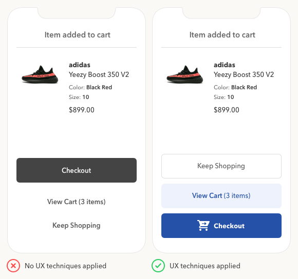
Add to cart section
This is a page that includes your customer’s information that they need to review and make necessary changes. For mobile conversion optimization, you shouldn’t force visitors to scroll back and forth to get the overview.
Our recommendation:
- Make sure all the information fits neatly into one screen for a smooth and seamless process, including price, shipping information, and product choices (quantity, size, and color)
Use full screen top layers
If you use top layer pop-ups that appear on your home screen, you should design them to fill the entire page. This not only eliminates distraction but also makes it easier for your visitors to interact with the different overlay elements.
Our recommendations:
- Insert a link on top layers so customers can click to get more information about shipping, payment plans, and warranties
- Remember to use a full-page design
3. Improve your checkout design on mobile
According to Baymard Institute, a better checkout design can increase conversion rate by 35.26%. This report also mentions that the second-ranked reason for mobile cart abandonment is requiring customer email or account signup to checkout.
Our recommendations:
- Collect emails before customers start the checkout process. In this way, they know that emails are required, or at least you can give further engagement actions via emails like reminding them to complete orders.

The third-ranked reason for cart abandonment on mobile is long checkout. You should make your mobile checkout form as short as possible for mobile conversion optimization.
Our recommendations:
- Eliminate all unnecessary fields to speed up the checkout process
- Enable floating labels, which are small labels appearing in the corner of form fields. They make it easier for your visitors to review and adjust information
- Leverage autofill, which populates forms with the previously saved information on their mobiles
- Use information validation features. When your customers enter information, it will make a small tick or cross next to the field. It’s better for the customers to know straight away that the information is incorrect rather than after clicking the “Place Order” or “Confirm” button.
4. Improve your loading speed on mobile
Google’s research shows that bounce rate grows by 32% if the loading time of your website goes from 1 second to 3 seconds. You can test your website speed using Google PageSpeed Insights. After you copy and paste your URL to the box, Google will analyze the result.
If your site speed is under 3 seconds, congratulations! If not, you can refer to the 2 most effective ways to speed up your website and optimize mobile conversion rate:
- PWA storefront (using PWA technology for websites): it helps users access desktop or mobile devices with a beautiful interface like a real app and faster speed than a regular website. Using PWA storefronts is helpful in various ways:
- Make your page load almost immediately and save data locally. It means PWA websites can operate well with unstable internet connection. If your customer revisits your website, they can browse it in offline mode without any network.
- Increase the loading performance metric, one of the most important metrics that determine website rank on search engines.
- Deliver a truly app-like experience. Mobile customers can simply pin your website app to the home screen.

- Shopping mobile app: this is an app for users to download from the Apple App Store or Google Play Store and then shop. You can capture revenue through mobile applications. According to SOASTA’s research, 51% of smartphone users are more likely to use a company’s mobile app when browsing or shopping on a smartphone because they can get rewards or points. The shopping mobile app itself can absolutely optimize mobile conversion:
- Increase customer retention
- Boost customer engagement and online revenue
Conclusion
Understanding customer experience is the first step in optimizing your website for mobile. You can make a master plan for mobile conversion optimization based on the checklist and tips in this article. Indeed, a lot of things can be done to convert websites to be mobile-friendly for a better customer shopping journey.
You can make step-by-step improvements to the way customers explore products, add to cart, and complete the checkout form to purchase. However, it’s undeniable that site loading speed is the leading factor in the overall process. Let’s make sure you can exploit PWA technology or shopping mobile apps to make a big move this year.


